AI Photo Colorization That Doesn't Look Fake: What I Learned
Most AI colorization looks cartoonish. After testing dozens of black and white photos, here is how to get natural, period-accurate colors that actually look believable.
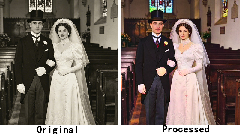
The first time I ran my grandmother's 1940s wedding photo through an AI colorizer, it came back looking like a Willy Wonka scene. Her dress was a weird lavender, the grass was neon green, and everyone had the same uniform pink skin tone. I almost gave up on the whole idea.
But I kept at it because seeing those photos in color — real color, not cartoon color — is genuinely moving. It makes people who only exist in black and white feel suddenly, vividly real. Here is what I figured out about getting colorization that doesn't look like a bad Instagram filter.
The problem with most AI colorization
Early colorization models were trained on modern digital photos — saturated, vibrant, high-contrast. So when you feed them a faded 1940s portrait, they try to make it look like a 2026 iPhone shot. That's why you get those lurid greens and plastic skin tones. It's not that the AI is bad — it's applying the wrong aesthetic to the wrong era.
Newer models like DDColor are better because they analyze the structure of the photo alongside the content. They understand that a 1940s suit should be a muted navy or charcoal, not electric blue. The results are more restrained, which is exactly what you want.
Use the large model for anything important
DDColor comes in two sizes: small and large. The small model is faster and cheaper, and it's fine for quick tests. But for photos you actually care about, use the large model. The difference in skin tones alone is worth it — the large model produces natural variation across different parts of the face (cheeks vs. forehead vs. jawline), while the small model tends toward uniformity.
Restore before you colorize
This one cost me a lot of credits to learn. If you colorize a damaged photo — one with scratches, fading, or stains — the AI interprets the damage as part of the image and colors it. You end up with a scratch that's been lovingly rendered in sepia. Always run restoration first, then colorize the clean result.
Period-appropriate colors matter more than you think
I colorized a photo of my dad as a kid in the 1960s, and his shirt came out bright lime green. It looked ridiculous. I realized later that the color was technically “correct” by the AI's standards — it had identified a shirt and applied a common shirt color from its training data. But nobody in 1965 was wearing lime green polyester. The color was accurate to “shirts in general” but completely wrong for the period.
The good news is that DDColor's large model handles this much better than older tools. It tends toward muted, earthy palettes for older photos, which is usually closer to reality. If a color looks suspiciously vibrant, it probably is.
When to skip colorization
Not every black and white photo needs color. Some photos have a mood or a composition that works better in monochrome — studio portraits with dramatic lighting, for example, or photos where the contrast between light and shadow is the whole point. Adding color to those can flatten them. I now ask myself: would this photo actually be better in color? Sometimes the answer is no.
The key realization I had: the goal isn't to make a 1940s photo look like it was taken yesterday. It's to make it feel real enough that you can imagine being there. Natural, period-appropriate color gets you there. Oversaturated, cartoonish color does the opposite.
Ready to colorize your old photos? ClarifyPix AI Colorization uses DDColor for natural results, and you can try it with the $1.99 7-day trial.